

Data Quality Dashboard
concept Explains how something works
On this page
- Recalculating metrics manually
- Setting a threshold on a metric
- Quality by Business Domain
- Quality by Source
- Quality by AI Agent
- Trust Center
- Data quality for a Stream
The Data Quality Dashboard gives you a single, visual overview of the quality of the data mastered in CluedIn. It is built on nine data quality metrics—Accuracy, Completeness, Connectivity, Consistency, Currentness, Relevance, Provenance, Explainability, and Human Accountability—and breaks them down by business domain, by source, by AI agent, and by overall trust, so you can quickly see where data quality issues are concentrated and act on them.
Consistency, Currentness, Provenance, and Explainability are per-record metrics. Consistency measures how often different sources agree on the same property value. Currentness measures how recently a record was last modified relative to an expected refresh interval (configurable by an administrator, 90 days by default). Provenance measures whether a record’s data can be traced back to a known source. Explainability measures whether a record’s properties map to a governed, documented vocabulary key rather than an untracked, free-form value. Human Accountability is the only organization-wide (not per-record) metric of the nine — see Trust Dimensions below.
To open the Data Quality Dashboard
-
On the navigation pane, go to Governance > Quality metrics.
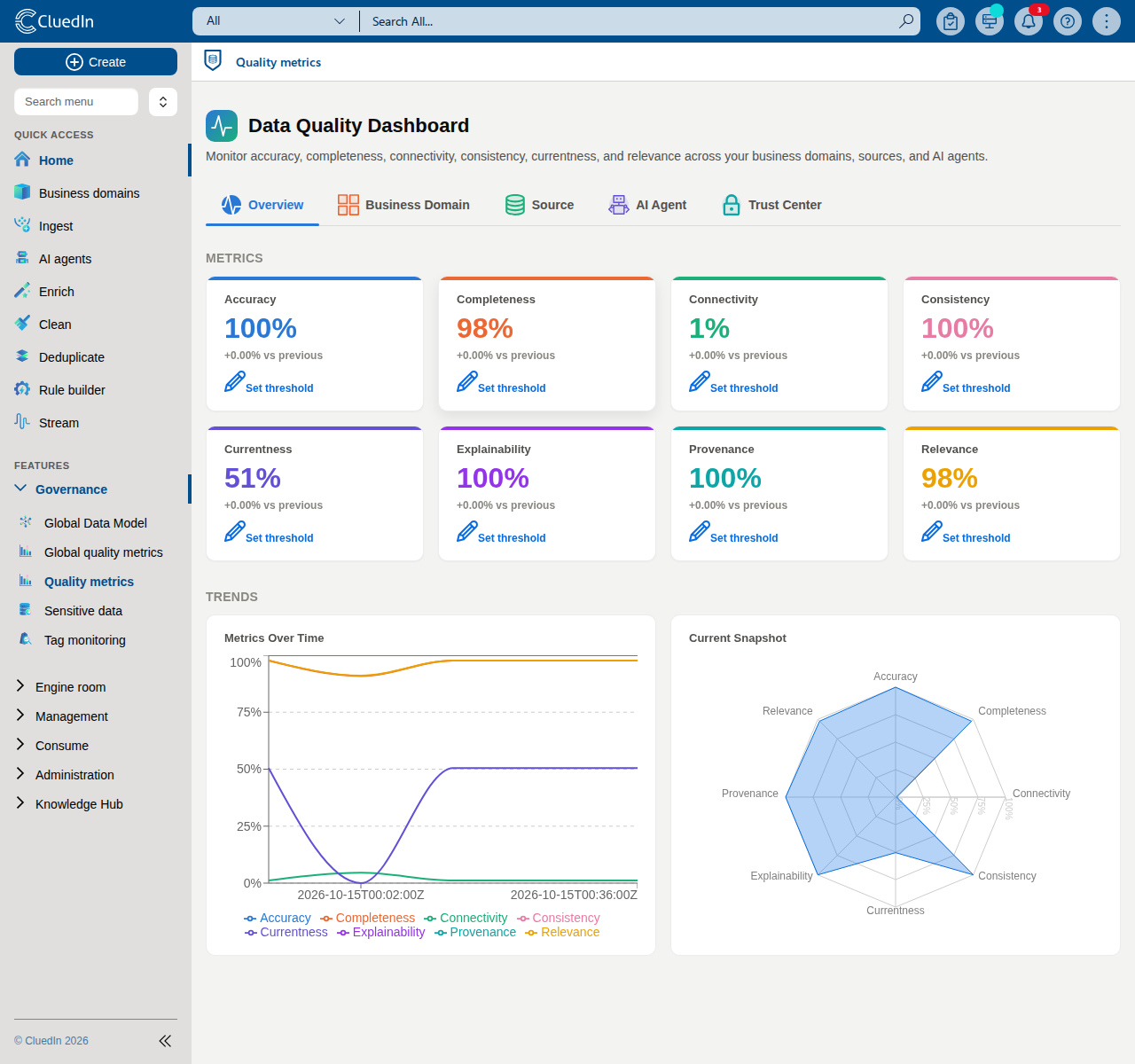
The dashboard is organized into five tabs:
- Overview – each data quality metric as an overall, organization-wide score, plus a trend chart showing every metric over time and a radar chart comparing them all at a glance.
- Business Domain – the Quality by Business Domain heatmap.
- Source – the Quality by Source breakdown.
- AI Agent – the Quality by AI Agent summary.
- Trust Center – the Trust Center overview, trust dimensions, freshness chart, governance maturity diagram, and improvement guides.
Recalculating metrics manually
The scores on this dashboard are only as current as the last time the jobs that compute them ran:
- Global metrics – computes the organization-wide metric scores shown throughout this dashboard. Runs once a day by default.
- High time resolution metrics – recomputes the metrics this organization keeps at a high time resolution. Runs every 15 minutes by default.
If you’ve just ingested or changed data and don’t want to wait for the next scheduled run, select Run Global metrics or Run High time resolution metrics at the top of the page to trigger the corresponding job immediately.

These are the same two jobs listed on the Jobs page under System-provided jobs — running them from here is a shortcut, not a separate action. If your organization requires approval to run jobs, selecting the button sends a request to the job’s owner instead of running it immediately.
Setting a threshold on a metric
Every metric tile, on the Overview tab and in the Trust Center, lets you set a target threshold:
- Select Set threshold on a metric tile, enter a whole-number percentage (for example,
80), and select Save. - Once a threshold is set, the tile shows a Target: X% badge, colored green when the metric’s current score meets or exceeds the threshold and red when it doesn’t.
- Select the badge at any time to change or clear the threshold.
-
If any metric is below its configured threshold when the dashboard loads, a notification appears listing which ones need attention.
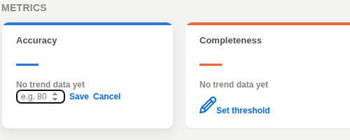
A threshold of 0, or no threshold set, means the metric has no target configured — no badge is shown and it’s never flagged as below target.
Quality by Business Domain
The Quality by Business Domain section shows a heatmap of every data quality metric against every business domain that has been scored. Each cell shows the score for one metric within one business domain, so you can quickly spot which combinations of metric and business domain need attention.
If no business domain has been scored yet, this section shows an empty state instead of the heatmap.
A business domain only appears in the heatmap once data quality metrics have been calculated for at least one record of that business domain.
Quality by Source
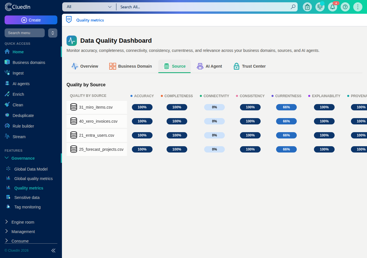
The Quality by Source section lists every source feeding data into your CluedIn environment — connectors, file uploads, API ingestion endpoints, databases, and enrichers alike — each shown by its own name (for example, the uploaded file’s name or the ingestion endpoint’s configured name) together with its icon or a generic source icon, so you can identify at a glance which systems are behind your data quality scores. Where the data quality metrics have been calculated for a specific source, the corresponding score is shown next to it; otherwise, the entry shows No data yet.
A source whose records all came from a single ingestion event (for example, a one-off file upload) can appear more than once if that file was ingested more than once — each ingestion gets its own score.
If no sources are connected yet, this section shows an empty state instead of the list.
Quality by AI Agent
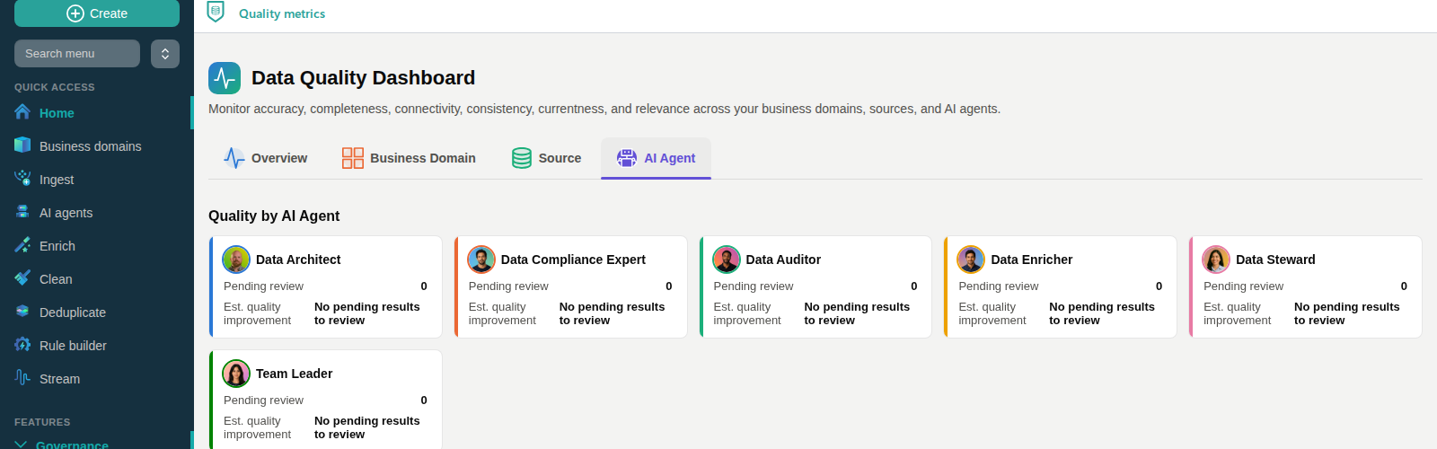
The Quality by AI Agent section lists your AI agents and shows, for each one, the following information:
-
Pending review – the number of results produced by that agent’s jobs that are waiting to be approved or rejected.
-
Est. quality improvement – an estimate, in percentage points, of how much the data quality metrics would improve, on average, if all of that agent’s pending results were approved. This estimate is only shown while the agent has at least one pending result; otherwise, the entry shows No pending results to review.
If no AI agents exist in your environment yet, this section shows an empty state instead of the list.
Trust Center
The Trust Center tab brings together an overall trust score, the trust-specific metrics, a view of how fresh your data is, a governance maturity diagram, and concrete guidance for improving each metric.
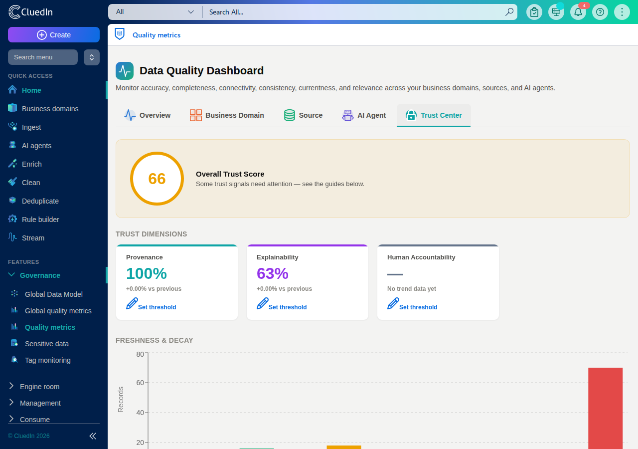
Overall Trust Score
The Overall Trust Score is a single number from 0–100, averaging every available data quality metric, including the trust dimensions below. It’s colour-coded:
- Green (80–100) – your data quality and trust signals are strong.
- Amber (50–79) – some trust signals need attention.
- Red (0–49) – multiple trust signals are below target.
Trust Dimensions
- Provenance – the fraction of a record’s data that can be traced back to a known, identifiable source.
- Explainability – the fraction of a record’s properties that map to a governed vocabulary key, rather than an untracked, free-form value whose meaning and origin aren’t documented.
- Human Accountability – the only organization-wide metric here, rather than per-record: the fraction of AI agent suggestions that were explicitly acted on by a person rather than auto-approved. This metric only appears once your organization has at least one AI agent suggestion.
Rejecting an AI agent suggestion always counts as a human decision. An approval only counts if auto-approve is currently turned off for AI agents (see AI Agents) — an auto-approved suggestion was never reviewed by a person.
Freshness & Decay
This chart groups your records into buckets by how many days have passed since they were last modified, so you can see at a glance how much of your data is fresh versus going stale. It’s built from the same Currentness metric shown on the Overview tab.
Governance Maturity
The Governance Maturity radar chart shows how much your organization actually uses five governance practices, each as a percentage from 0–100%:
- Cleaning – the percentage of your (non-archived) clean projects that have actually been applied at least once, rather than only ever created.
- Matching & Merging – the percentage of your (non-archived) matching/merging projects that run automatically on a schedule, rather than requiring someone to generate and commit candidates manually every time.
- Agent Coverage – the percentage of your active business domains that are targeted by at least one enabled AI agent job.
- Rule Coverage – the percentage of your vocabulary keys that are referenced by at least one rule.
- Data Sharing – the percentage of your streams that are started and have actually sent at least one record, rather than only ever configured.
A score of 0% on any axis means that practice hasn’t been set up yet for your organization, not that data is missing — the chart always shows all five axes.
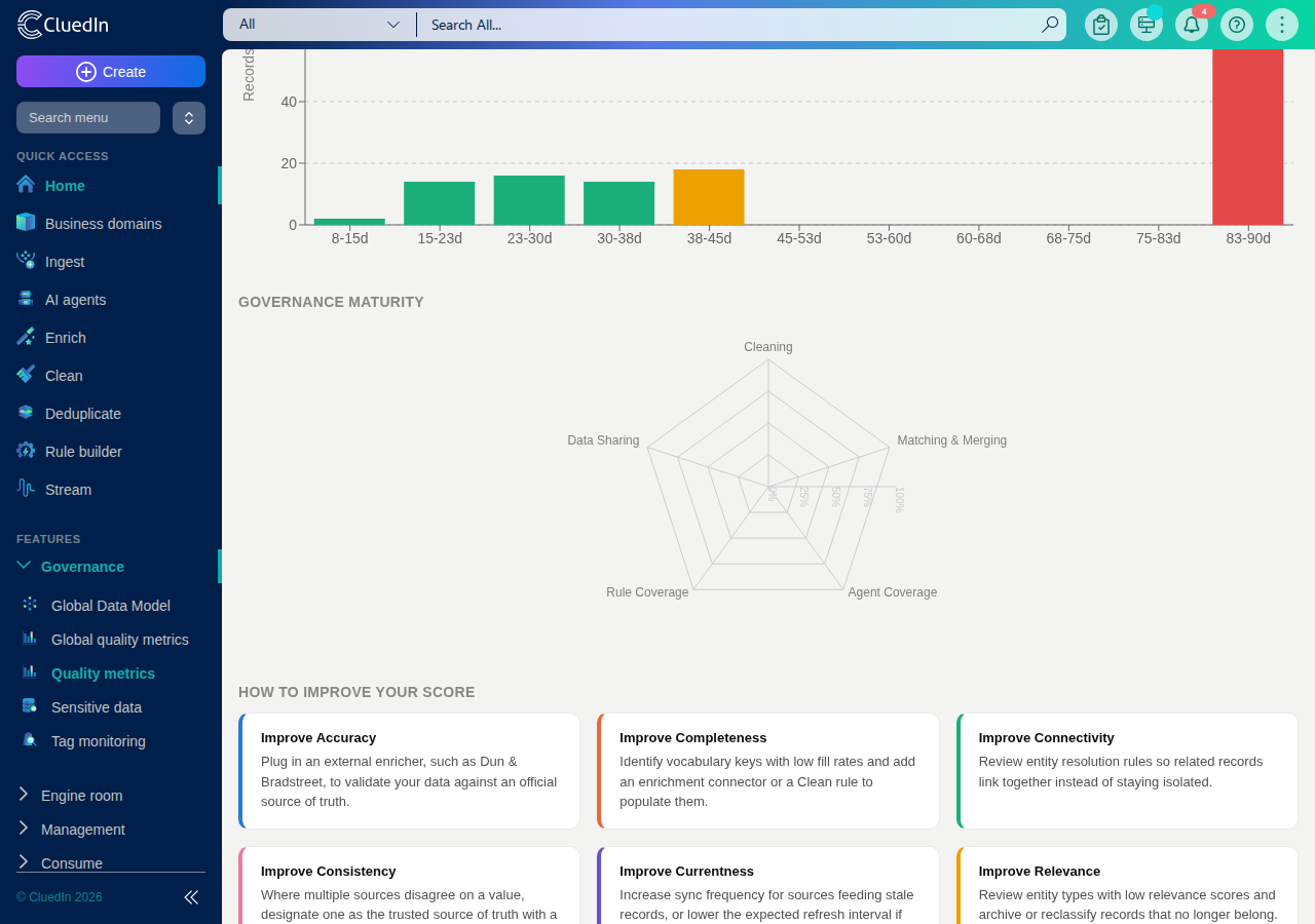
How to improve your score
Each metric has a short, concrete guide for improving it — for example, Accuracy suggests plugging in an external enricher, such as Dun & Bradstreet, to validate your data against an official source of truth.
Data quality for a Stream
Each Stream also has its own Data Quality tab, which shows the same data quality metrics scoped to that stream’s own business domain. For details, see View stream details.